How to Create Stunning Infographics: A Beginner Tutorial
Have you ever been impressed by those cool pictures that explain things really well?
Well, guess what – you can make them too!
Here we’ll learn how to turn boring facts into eye-catching stories. Not any rocket science or skills are needed, just your creativity.
What is Basically meant by stunning infographics?
| Stunning infographics are like really cool pictures that not only show information but also look super awesome. Imagine turning boring facts into eye-catching stories using colorful and interesting pictures – that’s what we mean by stunning infographics. It’s a way of making information not just easy to understand but also fun to look at! |
How To Make An Infographic?
Now the most important question comes: How to make an infographic?
Infographics are like visual storytellers, turning dull data into captivating tales. They are a fantastic way to share information in a way that’s not just easy to understand but also visually appealing.
If you’ve ever wondered how to create your own stunning infographics, you’re in the right place.
In this step-by-step guide, we’ll break down the process for you, making it easy for beginners to dive into the world of graphic storytelling.

Step 1: Define Your Purpose and Audience
Before you start creating your infographic, ask yourself: What do you want to convey, and who is your target audience? Knowing your purpose and audience will guide the content and design choices you make.
Step 2: Gather and Organize Your Information
Collect all the data and information you want to include in your infographic. Ensure that it’s relevant, concise, and supports your purpose. Organize the information logically to create a seamless flow within your infographic.
Step 3: Choose the Right Template or Layout
Decide on the layout of your infographic. Many online tools and software provide pre-designed templates. Choose one that suits your content and makes it visually appealing. Consider the arrangement of text, images, and any other elements you plan to incorporate.
Step 4: Create a Visually Engaging Design
Now comes the fun part – designing your infographic. Use colors, fonts, and images that complement each other. Make sure the design aligns with your purpose and resonates with your audience. Keep it visually balanced and avoid clutter.
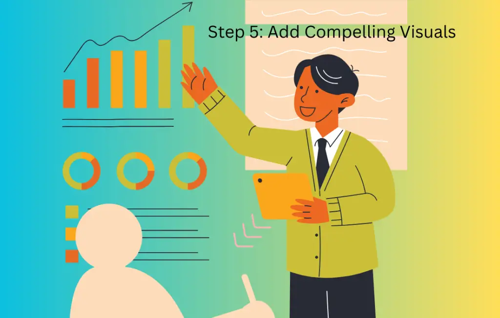
Step 5: Add Compelling Visuals
Graphics and icons play a crucial role in making your infographic visually appealing. Use relevant images and icons to enhance understanding and add interest. Infographics are all about making information easy on the eyes!
Step 6: Craft a Clear and Concise Message
Your infographic should tell a clear and concise story. Write short, impactful headlines and captions. Ensure that each element contributes to the overall message you want to convey.
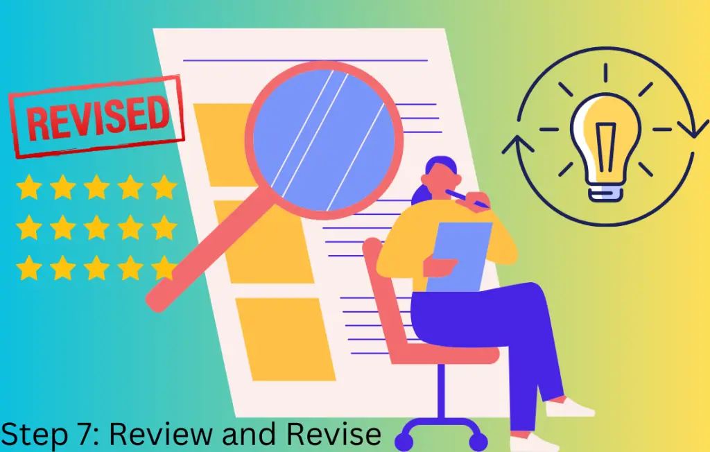
Step 7: Review and Revise
Before finalizing your infographic, review it thoroughly. Check for accuracy, clarity, and coherence. Make revisions as needed to improve the overall quality of your visual story.
Step 8: Save and Share
Once you’re satisfied with your infographic, save it in a format suitable for sharing, such as JPEG or PNG. You can then share it on social media, include it in presentations, or use it on your website to effectively communicate your message.
Read More: What You Should Know About Blogging? 5 Facts
Creating stunning infographics may seem like a daunting task at first, but with the right approach, anyone can do it. Follow these steps, use your creativity, and start turning your information into visually appealing stories that leave a lasting impression.
10 Easy Steps To Design An Infographic From Scratch
So, here I elaborate on the above 8 steps in detail with examples for better understanding.
Step 1: Define Your Purpose and Audience
In the initial step of creating an infographic, it’s essential to crystalize the purpose behind your visual narrative and identify the target audience you intend to reach.
Purpose:
Start by clarifying the reason for developing the infographic. Ask yourself, “What do I want to achieve with this infographic?”
Your purpose could range from educating your audience on a specific topic, presenting data in a more accessible format, telling a story, or even persuading them to take a particular action.
Understanding your purpose will serve as the guiding star throughout the infographic creation process.
Audience:
Once you’ve defined your purpose, shift your focus to the audience – the individuals who will be engaging with your infographic. Consider their demographics, interests, and knowledge level.
Are you addressing professionals in a specific industry, students, or a more general audience? Customizing your infographic to resonate with your audience ensures that the content, tone, and design will be most effective in conveying your message.

Example:
Suppose you’re creating an infographic to showcase the benefits of a new fitness app. Your purpose might be to persuade individuals to download and use the app regularly. Your audience could be health-conscious individuals, ranging from fitness enthusiasts to beginners looking to adopt a healthier lifestyle. Understanding this allows you to craft content and design elements that speak directly to the needs and interests of your target users.
By defining your purpose and audience in this first step, you set a strong foundation for creating an infographic that not only looks visually appealing but also effectively communicates your intended message to the right people.
Read More: Top 10 Blogging Techniques: Every Blogger Should Know!
Step 2: Gather and Organize Your Information
Now that you have a clear understanding of your purpose and target audience, it’s time to gather the relevant information that will populate your infographic. This step involves collecting data, facts, and key points that support your overarching message.
Gathering Information:
Identify the key data points, statistics, or information that align with your purpose. This could include research findings, survey results, or any relevant content.
Ensure the accuracy and reliability of the information you gather. Use reputable sources and verify data points to maintain the credibility of your infographic.
Organizing Information:
Once you have collected all the necessary information, organize it logically and coherently. Consider the flow of the story you want to tell through your infographic.
Group related information together and determine the hierarchy of importance. Decide what should be highlighted as primary points and what can serve as supporting details.

Example:
Continuing with the fitness app infographic example, you might gather information on the app’s features, user testimonials, and statistics on the positive impact on users’ health. Organize this information into sections, such as “Key Features,” “User Success Stories,” and “Health Benefits.”
By systematically gathering and organizing your information, you ensure that your infographic is not only visually appealing but also conveys a well-structured and coherent narrative. This sets the stage for a more engaging and effective communication of your message to your target audience.
Read More: Can Blogging Really Make A Money – Must Read!
Step 3: Choose the Right Template or Layout
With your information in hand, it’s time to decide on the visual structure of your infographic. Choosing the right template or layout is crucial in presenting your information in a visually appealing and organized manner.
Selecting a Template:
Many online tools and graphic design software provide pre-designed templates for infographics. Explore these templates to find one that aligns with the tone and purpose of your infographic.
Consider the overall structure of the template, the placement of sections, and the balance between text and visuals.
Customizing the Layout:
Tailor the chosen template to fit your specific content. Adjust the size and placement of text boxes, images, and other elements to create a layout that flows seamlessly.
Ensure that the layout enhances the readability of your information. Avoid overcrowding and maintain a visually balanced composition.

Example:
In the fitness app infographic, you might choose a template that features a clear section for highlighting key features, another for user testimonials, and a visually appealing section for health-related statistics. Customize the template to accommodate the specific details and visual elements you gathered in the previous steps.
By selecting the right template or creating a custom layout, you establish the framework for your infographic. This step ensures that your information is presented in an organized and visually appealing manner, setting the stage for a more engaging and effective visual narrative.
Read More: Can Blogging Make Me Rich – 5 Facts You Should Know!
Step 4: Create a Visually Engaging Design
Now that you have a layout in place, it’s time to infuse your infographic with visual appeal. The design is a critical element in capturing your audience’s attention and conveying your message effectively.
Use Coherent Design Elements:
Choose a color scheme that complements your brand or the overall theme of your infographic. Consistency in color creates a cohesive look.
Select fonts that are easy to read and align with the tone of your message. Maintain a consistent font style and size throughout.
Visual Hierarchy:
Establish a visual hierarchy to guide your audience through the information. Use varying font sizes, colors, or graphical elements to emphasize key points.
Ensure that the most critical information is prominently displayed, making it easily accessible to your audience.
Whitespace and Balance:
Embrace whitespace (empty space) strategically to avoid overcrowding. It helps in maintaining clarity and directing focus to essential elements.
Balance the placement of text and visuals to create a harmonious overall design. A well-balanced infographic is more visually appealing and user-friendly.

Example:
In the fitness app infographic, you might use vibrant and energetic colors to evoke a sense of health and vitality. Choose a clean, modern font for readability. Employ icons and images that resonate with a healthy lifestyle to enhance the visual appeal.
By focusing on the visual design, you transform your infographic from a collection of information into a visually engaging and cohesive story. This step ensures that your audience not only understands the content but is also captivated by the overall look and feel of your infographic.
Read More: 5 Critical Blogging Mistakes Newbies Must Avoid for Success
Step 5: Add Compelling Visuals
With your design in place, it’s time to enhance your infographic by incorporating compelling visuals. Visual elements play a crucial role in making information more digestible and memorable.
Select Relevant Images and Icons:
Choose images and icons that directly support and illustrate your key points. Ensure that they align with the theme and purpose of your infographic.
Use high-quality visuals to maintain a professional appearance. Avoid pixelation or blurry images that can detract from the overall impact.
Graphs and Charts for Data:
If your infographic includes data or statistics, use graphs and charts to present the information visually. Bar graphs, pie charts, and line graphs can make complex data more accessible.
Label your graphs clearly, and consider using colors to distinguish between different data sets.
Infographic-Specific Elements:
Experiment with infographic-specific elements like timelines, flowcharts, or illustrated maps to add a dynamic touch to your design.
Ensure that these elements contribute to the overall narrative and do not overwhelm the viewer.

Example:
The fitness app infographic, includes images of individuals using the app, showcasing its features in action. Use icons of healthy foods, exercise equipment, and progress indicators to visually represent key concepts. If presenting user statistics, incorporate a bar chart or a pie chart to illustrate achievements.
You make your infographic more engaging and memorable. Visuals serve as powerful tools for conveying information, especially for audiences who prefer a more visual learning experience.
Read More: Monetization Strategies for Bloggers: 7 Proven Ways to Monetize
Step 6: Craft a Clear and Concise Message
Now that your infographic is visually engaging, it’s time to focus on the content and ensure that your message is clear, concise, and effectively communicated.
Write Short, Impactful Headlines and Captions:
Craft headlines and captions that succinctly convey the main points. Use clear and compelling language to capture your audience’s attention.
Keep the text concise to maintain readability. Avoid lengthy paragraphs, and opt for bullet points or short sentences when possible.
Ensure Text Supports Visual Elements:
Align the text with the visuals to create a cohesive narrative. Each piece of text should complement and enhance the understanding of the accompanying images or graphs.
Be strategic in placing text, ensuring that it guides the viewer through the infographic in a logical sequence.
Maintain Consistency in Tone:
Keep the tone of your messaging consistent throughout the infographic. Whether it’s informative, persuasive, or casual, maintaining a consistent tone helps in delivering a unified message.
Check for any potential jargon or complex language that might confuse your audience. Aim for clarity in communication.

Example:
In the fitness app infographic, use concise headlines like “Transform Your Fitness Journey” or “Discover Key Features.” Craft captions that highlight user success stories, such as “Real Results: Meet our Satisfied Users.” Ensure that the text complements the visuals, reinforcing the app’s positive impact on users’ health.
Crafting a clear and concise message ensures that your audience can quickly grasp the main points of your infographic. This step is crucial for effective communication and achieving the intended impact with your visual narrative.
Read More: 7 Proven Strategies for Creating Engaging Blog Posts: Learn How?
Step 7: Review and Revise
Before finalizing your infographic, it’s essential to conduct a thorough review to ensure accuracy, clarity, and overall effectiveness. This step helps in refining your visual narrative and addressing any potential issues.
Check for Accuracy:
Verify the accuracy of all information presented in your infographic. Cross-check data points, statistics, and any factual details to ensure they are up-to-date and reliable.
Confirm that any references or sources are properly cited if applicable.
Evaluate Clarity and Coherence:
Assess the overall clarity of your infographic. Ensure that the flow of information makes sense and follows a logical sequence.
Look for any potential areas of confusion or ambiguity in both the visuals and the accompanying text.
Seek Feedback:
Share your infographic with others, preferably individuals who represent your target audience. Gather feedback on their understanding of the content, the visual appeal, and any areas that may need improvement.
Consider incorporating constructive feedback to enhance the quality of your infographic.
Revise Accordingly:
Make necessary revisions based on your review and feedback received. Address any identified issues, refine the language, and adjust visuals as needed.
Pay attention to the overall visual balance, ensuring that the design remains cohesive and aesthetically pleasing.

Example:
In the fitness app infographic, during the review process, you may discover a discrepancy in a user testimonial or notice that a particular visual element is unclear. Address these issues by verifying the testimonial details and adjusting or replacing the visual element to enhance clarity.
By conducting a comprehensive review and revision, you elevate the overall quality of your infographic, ensuring it effectively communicates your message and resonates with your audience.
Read More: The Art of Crafting Perfect Headlines: 7 Proven Techniques
Step 8: Save and Share
Congratulations on creating your stunning infographic! Now, it’s time to save your work and share it with your intended audience. Follow these final steps to ensure your infographic reaches its full potential:
Save in Suitable Formats:
Save your infographic in formats that are widely accepted and easily shareable, such as JPEG, PNG, or PDF. Consider the platform where you plan to share it and choose the format that best suits your needs.
Maintain Visual Integrity:
Double-check that your infographic looks as intended in the saved format. Ensure that colors, fonts, and images remain visually consistent and appealing.
Share on Relevant Platforms:
Distribute your infographic on platforms where your target audience is likely to engage. This could include social media, your website, presentations, or even email newsletters.
Customize your approach based on the characteristics of each platform. For example, social media posts may require a catchy caption to encourage sharing.
Encourage Engagement:
Accompany your infographic with a call to action if appropriate. Encourage viewers to share, comment, or take a specific next step, depending on your infographic’s purpose.
Monitor engagement metrics, such as likes, shares, or website clicks, to gauge the effectiveness of your infographic.

Example:
For the fitness app infographic, share it on social media platforms with a caption like “Revolutionize your fitness journey with our app! Check out the incredible features and success stories. Download now for a healthier you!” Include relevant hashtags to increase visibility.
By saving and strategically sharing your infographic, you amplify its impact and extend its reach to a broader audience. This step completes the process, allowing your visually compelling narrative to captivate and inform your intended viewers.
Read More: How To Use Pinterest For Blogging- 5 Proven Ways
FAQs
| 1. Can infographics be used for any type of content, or are they specific to certain topics? Explore the versatility of infographics and discover how they can be applied to a wide range of subjects. Learn about creative ways to tailor infographics to different content types and industries. |
| 2. Are there any copyright considerations when using images or icons in an infographic? Delve into the legal aspects of using visuals in your infographic. Understand the importance of respecting copyright laws and explore sources for obtaining royalty-free images and icons for your design. |
| 3. How can infographics enhance engagement on social media platforms? Uncover strategies for leveraging infographics to boost engagement on social media. Learn about optimal posting times, effective captions, and other techniques to maximize the impact of your infographic on various social channels. |
| 4. Can infographics be interactive, and how does that impact user engagement? Explore the dynamic world of interactive infographics. Understand how incorporating interactive elements can elevate user engagement and provide a more immersive experience for your audience. |
| 5. What role do storytelling techniques play in creating compelling infographics? Discover how storytelling principles can be applied to infographics. Explore narrative structures, character development, and other storytelling techniques that transform your infographic into a captivating visual story. |
| 6. How do infographics contribute to SEO and website traffic? Learn about the SEO benefits of incorporating infographics into your content strategy. Understand how well-designed infographics can attract more website traffic, improve user experience, and contribute to higher search engine rankings. |
| 7. Are there any emerging trends or innovations in the world of infographic design? Stay updated on the latest trends and innovations in infographic design. Explore new tools, techniques, and design styles that are shaping the future of visual communication in the digital age. |
Conclusion:
And there you have it – the colorful world of infographics! From defining your purpose to crafting visually stunning designs, you’ve ventured through the basics of creating eye-catching visuals.
Now armed with the skills to turn information into engaging stories, your creative adventure has just begun. Infographics are more than just pictures; they’re your passport to sharing ideas, telling stories, and making information not just understandable but downright enjoyable.
So, whether you’re sharing the benefits of a new app or simplifying complex data, let your creativity flow. Dive into the world of infographics, where each pixel tells a tale, and every color carries a message. Go ahead, share your newfound superpower with the world, and let the curiosity you’ve sparked lead you to even more exciting creations.
Infographics, Infographics, Infographics, Infographics, Infographics, Infographics, Infographics, Infographics, Infographics, Infographics, Infographics, Infographics, Infographics, Infographics, Infographics, Infographics


